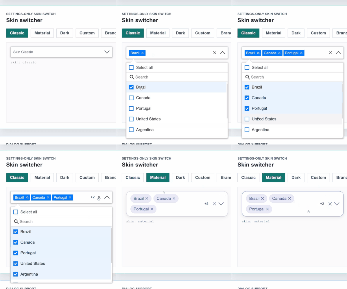
# @stackline/multiselect
> Framework-agnostic vanilla JavaScript multiselect dropdown with headless state APIs, skins, object data, body overlays, and accessibility-focused keyboard/ARIA tested behavior.
[](https://www.npmjs.com/package/@stackline/multiselect)
[](https://github.com/alexandroit/stackline-multiselect)
[](https://github.com/alexandroit/stackline-multiselect)
[](https://alexandro.net/docs/multiselect/)
[](https://www.reddit.com/r/Stackline/)
**[Documentation](https://alexandro.net/docs/multiselect/)** | **[npm](https://www.npmjs.com/package/@stackline/multiselect)** | **[Issues](https://github.com/alexandroit/stackline-multiselect/issues)** | **[Repository](https://github.com/alexandroit/stackline-multiselect)**
**Current package version:** `1.1.6`
---
## Why this package?
`@stackline/multiselect` is maintained as part of the Stackline package collection.
## Compatibility
| Item | Value |
| :--- | :--- |
| Package | `@stackline/multiselect@1.1.6` |
| API target | `See the package-specific API reference` |
| Supported Node.js | `See supported framework requirements` |
| License | `MIT` |
| Module type | `commonjs` |
| Main entry | `src/stackline-multiselect.js` |
| Types | `types/stackline-multiselect.d.ts` |
| Runtime dependencies | `none` |
## Installation
```bash
npm install @stackline/multiselect
```
## Usage and API reference
> A maintained vanilla JavaScript multiselect dropdown for framework-agnostic applications, with object data, skins, render callbacks, headless/state APIs, body-overlay positioning, and accessibility-focused and keyboard/ARIA tested behavior.
**[Documentation & Live Demos](https://alexandro.net/docs/multiselect/)** | **[Direct Download](https://github.com/alexandroit/stackline-multiselect/raw/refs/heads/main/dist/stackline-multiselect-1.1.4.zip)** | **[StackBlitz](https://stackblitz.com/github/alexandroit/stackline-multiselect?file=docs%2Fmain.js&startScript=start&initialpath=%2Fbasic)** | **[npm](https://www.npmjs.com/package/@stackline/multiselect)** | **[Issues](https://github.com/alexandroit/stackline-multiselect/issues)** | **[Repository](https://github.com/alexandroit/stackline-multiselect)**
**Latest vanilla release:** `1.1.6`
---
> **Credits:** Current maintenance, vanilla package stewardship, publishing, and documentation by [Alexandro Paixao Marques](https://github.com/alexandroit/stackline-multiselect).
---
## Why this library?
`@stackline/multiselect` is for projects that need a reliable multiselect without a framework dependency. It works with plain HTML, server-rendered pages, static sites, CMS templates, Web Components, and framework apps that prefer to mount a small browser widget directly.
The package ships a styled component API and a lower-level state API. Start with `new StacklineMultiSelect(...)` for forms, filters, dashboards, and admin screens. Use `createStacklineMultiSelectState(...)` when your application needs to own every element and CSS class while keeping Stackline selection, filtering, grouping, keyboard handling, ARIA props, and callbacks.
The `1.1.x` line ports the React `19.1.3` combobox-contract work to vanilla JavaScript: selected object preservation, `aria-selected` plus `aria-checked`, configurable keyboard behavior, focus fixes after mouse selection, headless/state prop getters, render callbacks, body overlays for clipped dialogs, and the same 64-country live test matrix.
## Features
| Feature | Supported |
| :--- | :---: |
| Framework-agnostic vanilla JavaScript | Yes |
| Multi-select and single-select modes | Yes |
| Object data with configurable `primaryKey` / `labelKey` | Yes |
| Styled component API | Yes |
| Headless `createStacklineMultiSelectState` API | Yes |
| Search and filter | Yes |
| Group by field or function | Yes |
| Select all, clear all, and per-item remove actions | Yes |
| Custom option, badge, empty-state, and footer render callbacks | Yes |
| Lazy rendering and scroll-to-end callbacks | Yes |
| Built-in `classic`, `material`, `dark`, `custom`, and `brand` skins | Yes |
| Custom skins through CSS variables | Yes |
| Accessibility-focused and keyboard/ARIA tested navigation | Yes |
| Multiselect options expose both `aria-selected` and `aria-checked` | Yes |
| Backspace/Escape/Space/Tab combobox contract controls | Yes |
| Selected object preservation across async data refreshes | Yes |
| Dialog and overflow-container support through `appendToBody` / `tagToBody` | Yes |
| Direct browser download | Yes |
| Generic TypeScript declarations | Yes |
| Shadow DOM-safe outside clicks | Yes |
## Table of Contents
1. [Installation](#installation)
2. [Option 1: npm Usage](#option-1-npm-usage)
3. [Option 2: Direct Download](#option-2-direct-download)
4. [Basic Usage](#basic-usage)
5. [Customization Paths](#customization-paths)
6. [Headless State Usage](#headless-state-usage)
7. [Combobox Contract](#combobox-contract)
8. [Settings](#settings)
9. [Skins](#skins)
10. [Render Callbacks](#render-callbacks)
11. [Events](#events)
12. [Methods](#methods)
13. [Official Vanilla Test Matrix](#official-vanilla-test-matrix)
14. [Run Locally](#run-locally)
15. [Security](#security)
16. [Community and Links](#community-and-links)
17. [License](#license)
## Installation
```bash
npm install @stackline/multiselect@1.1.6 --save-exact
```
Use this package when your project needs direct browser usage without Angular, React, Vue, or a bundler.
The package has no runtime npm dependencies. Its declarations are compatible with TypeScript 3.9 and current TypeScript releases.
## Option 1: npm Usage
Use this option first when the project installs packages with npm.
```html
```
## Option 2: Direct Download
Use the direct download when your project does not use npm:
```text
https://github.com/alexandroit/stackline-multiselect/raw/refs/heads/main/dist/stackline-multiselect-1.1.4.zip
```
Extract the archive and reference the copied files:
```html
```
## Basic Usage
```html
```
`idKey` is still accepted for compatibility. New examples use `primaryKey`.
### TypeScript
The constructor and headless state APIs infer the item type:
```ts
import StacklineMultiSelect = require("@stackline/multiselect");
interface Country {
id: number;
itemName: string;
region: string;
}
const dropdown = new StacklineMultiSelect("#countries", {
data: countries,
settings: { primaryKey: "id", labelKey: "itemName" },
onChange: (selected) => console.log(selected[0]?.region)
});
```
CommonJS, direct browser globals, historical deep imports, and plain JavaScript usage remain unchanged.
## Customization Paths
| Layer | Best for | What you own |
| :--- | :--- | :--- |
| `new StacklineMultiSelect(...)` | Forms, filters, dashboards, reports, and admin screens. | Data, selected values, settings, events, and optional render callbacks. |
| Render callbacks | Custom option rows, custom chips, empty states, and menu footer content. | Small pieces of HTML while the component keeps behavior and ARIA. |
| `createStacklineMultiSelectState(...)` | Fully custom UI, design systems, or existing combobox shells. | All markup and CSS, while Stackline provides state, prop getters, keyboard flow, grouping, and callbacks. |
For most teams, start with the styled component. Use render callbacks when the layout needs richer rows. Use the headless state API when the application must own the complete HTML structure.
## Headless State Usage
`createStacklineMultiSelectState` exposes state, actions, grouped/visible options, selected badges, and prop getters. It does not render DOM for you.
```html
```
## Combobox Contract
The default keyboard contract is enabled and can be configured per instance:
```js
settings: {
keyboard: {
space: true,
spaceOptionAction: "toggle",
tab: true,
arrows: true,
escape: true,
backspaceRemovesLastWhenSearchEmpty: false,
deleteRemovesFocusedBadge: true
}
}
```
Behavior tested in the live routes:
| Key | Contract |
| :--- | :--- |
| `Space` on trigger | Opens or closes the dropdown. |
| `Space` on option | Toggles the focused option and keeps focus predictable. |
| `Space` in search | Types a normal space. |
| `Tab` | Moves to the next focusable control and does not select an option. |
| `ArrowUp` / `ArrowDown` | Moves through options when the list is open. |
| `Escape` | Closes the list without clearing selected values. |
| `Backspace` in empty search | Disabled by default for removal. Enable `backspaceRemovesLastWhenSearchEmpty` only if your product wants that behavior. |
| `Backspace` / `Delete` on focused badge remove button | Removes that badge when `deleteRemovesFocusedBadge` is enabled. |
## Settings
```js
settings: {
primaryKey: "id",
labelKey: "itemName",
singleSelection: false,
text: "Select",
selectAllText: "Select all",
unSelectAllText: "Clear all",
enableCheckAll: true,
enableSearchFilter: true,
searchPlaceholderText: "Search",
searchBy: ["itemName"],
badgeShowLimit: 4,
showClearAll: true,
maxHeight: 260,
showCheckbox: true,
noDataLabel: "No data",
groupBy: "",
limitSelection: 0,
lazyLoading: false,
lazyPageSize: 20,
appendToBody: false,
tagToBody: false,
autoPosition: true,
skin: "classic",
keyboard: {
space: true,
spaceOptionAction: "toggle",
tab: true,
arrows: true,
escape: true,
backspaceRemovesLastWhenSearchEmpty: false,
deleteRemovesFocusedBadge: true
}
}
```
`settings.skin` is the current API. `settings.theme` remains a compatibility alias.
## Skins
Built-in skins:
| Skin | Usage |
| :--- | :--- |
| `classic` | Compact classic dropdown styling. |
| `material` | Material-style rounded controls and chips. |
| `dark` | Dark UI surfaces. |
| `custom` | CSS-variable starter skin for custom projects. |
| `brand` | Stackline brand skin. |
Runtime skin switching:
```js
dropdown.setTheme("material");
```
Custom skin example:
```css
.stackline-dropdown.theme-brand,
.dropdown-list.theme-brand {
--stackline-ms-primary: #7c3aed;
--stackline-ms-primary-soft: rgba(124, 58, 237, 0.14);
--stackline-ms-surface: #ffffff;
--stackline-ms-surface-soft: #f5f3ff;
--stackline-ms-outline: #c4b5fd;
--stackline-ms-outline-strong: #7c3aed;
--stackline-ms-on-surface: #22183f;
--stackline-ms-on-surface-muted: #6b5d80;
--stackline-ms-chip-bg: #ede9fe;
--stackline-ms-chip-text: #5b21b6;
}
```
## Render Callbacks
```js
new StacklineMultiSelect("#countries", {
data: countries,
selected: [],
settings: { primaryKey: "id", labelKey: "itemName", skin: "classic" },
renderItem: function (item) {
return "" + item.itemName + "" + item.capital + "";
},
renderBadge: function (item) {
return item.itemName;
},
renderEmpty: function () {
return "No matching countries";
},
renderMenuFooter: function (context) {
return context.selectedItems.length + " selected";
}
});
```
Legacy names `itemTemplate`, `badgeTemplate`, `emptyTemplate`, and `footerTemplate` are still supported.
String results from render callbacks are interpreted as trusted HTML for compatibility. Do not concatenate untrusted values into those strings. Return a DOM node built with `textContent` when callback data can come from users or external systems. Default labels and messages already use `textContent`.
## Events
Callbacks:
```js
new StacklineMultiSelect("#countries", {
data: countries,
selected: [],
settings: { primaryKey: "id", labelKey: "itemName" },
onSelect: function (item) {},
onDeSelect: function (item) {},
onDeselect: function (item) {},
onSelectAll: function (items) {},
onDeSelectAll: function (items) {},
onDeselectAll: function (items) {},
onChange: function (items) {},
onOpen: function (items) {},
onClose: function (items) {},
onScrollToEnd: function (payload) {}
});
```
DOM events are also dispatched from the host element:
```js
document.getElementById("countries").addEventListener("stackline:change", function (event) {
console.log(event.detail);
});
```
Event names include `stackline:select`, `stackline:deselect`, `stackline:select-all`, `stackline:deselect-all`, `stackline:change`, `stackline:open`, `stackline:close`, and `stackline:scroll-to-end`.
## Methods
```js
dropdown.open();
dropdown.close(true);
dropdown.toggle();
dropdown.clear();
dropdown.selectAll();
dropdown.deSelectAll();
dropdown.setSelected([{ id: 2, itemName: "Canada" }]);
dropdown.setData(nextCountries);
dropdown.setSettings({ skin: "dark" });
dropdown.setTheme("brand");
dropdown.destroy();
```
## Official Vanilla Test Matrix
The live app follows the same route structure used by the React `19.1.3` playground. Each route has a live dropdown, code panel, JSON panel, event log, and footer navigation.
| Route | Purpose |
| :--- | :--- |
| `/basic` | Basic usage |
| `/keyboard-contract` | Keyboard feature switches |
| `/aria-state` | `aria-selected` and `aria-checked` audit |
| `/headless-aria` | 100% custom HTML with ARIA prop getters |
| `/state-hook` | State-only API controls |
| `/slots-api` | Render callbacks |
| `/type-safe-factory` | Factory-style plain object helpers |
| `/async-object-preservation` | Selected objects survive async data refreshes |
| `/single-selection` | Single selection |
| `/search-filter` | Search filter |
| `/custom-search-api` | Async search pattern |
| `/search-filter-by-property` | Search by multiple object fields |
| `/search-add-new-item` | Add-new-item workflow |
| `/group-by` | Grouped object data |
| `/templating` | Custom row and badge HTML |
| `/template-driven-forms` | Plain form state |
| `/reactive-forms` | State-driven validation |
| `/virtual-scrolling` | Large list scroll |
| `/lazy-loading-api` | Lazy loading |
| `/remote-data` | Remote data refresh |
| `/list-loop` | Repeated instances |
| `/dialog` | Overflow-hidden dialog test |
| `/multiple-dropdowns` | Multiple independent instances |
| `/dynamic-data` | Runtime `setData` |
| `/methods` | Imperative methods |
| `/events` | Callback and DOM event stream |
| `/disabled` | Disabled state |
| `/limit-selection` | Selection limit |
| `/limit-badges` | Badge overflow counter |
| `/all-visible-counter` | Counter disappears when all selected badges are visible |
| `/custom-placeholder` | Vertically centered placeholder |
| `/styling` | Skins and variables |
| `/body-overlay-auto` | Body overlay with auto positioning |
## Run Locally
```bash
npm test
```
For a quick static live preview, serve the repository root and open `/basic`.
## Security
Report vulnerabilities privately by following [SECURITY.md](https://github.com/alexandroit/stackline-multiselect/security/policy). Do not disclose exploit details in a public issue.
## Community and Links
- [Stackline website](https://alexandro.net/)
- [GitHub projects](https://github.com/alexandroit)
- [npm packages](https://www.npmjs.com/~alex360qc)
- [Reddit community — r/Stackline](https://www.reddit.com/r/Stackline/)
- [Maintainer LinkedIn](https://www.linkedin.com/in/aleinfo/)
Use the repository's issue tracker for reproducible bugs and feature requests.
Join r/Stackline to share examples, ask usage questions, and discuss releases.
## License
MIT
## Credits and original authors
- Copyright (c) 2026 Stackline.
- Stackline maintenance: [Alexandro Paixao Marques](https://www.linkedin.com/in/aleinfo/) and [Stackline contributors](https://github.com/alexandroit).
Original copyright, license notices and contributor acknowledgements remain part of this distribution. Stackline maintenance does not replace authorship of the original work.
## Community and Links
- [Stackline website](https://alexandro.net/)
- [GitHub projects](https://github.com/alexandroit)
- [npm packages](https://www.npmjs.com/~alex360qc)
- [Reddit community — r/Stackline](https://www.reddit.com/r/Stackline/)
- [Maintainer LinkedIn](https://www.linkedin.com/in/aleinfo/)
Use this repository's issue tracker for reproducible bugs and feature requests. Join r/Stackline for examples, usage questions and release discussions.